Case Study
Contact Center Employee of Choice
Client:
Contact Center Employee of Choice
Purpose:
- Redesign corporate website
- Redesign the company logo
- Modify color scheme
- Customize fill in contact questionnaires
- Page section additions
Project Achievements:
- Wireframe
- User Interface
- HTML/CSS/Responsive
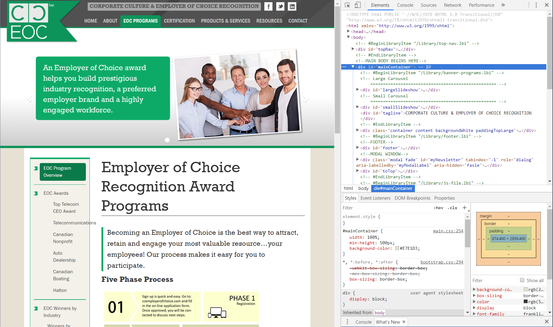
Redesigned the corporate website to be responsive on different screen sizes and device platforms.
The 'original'
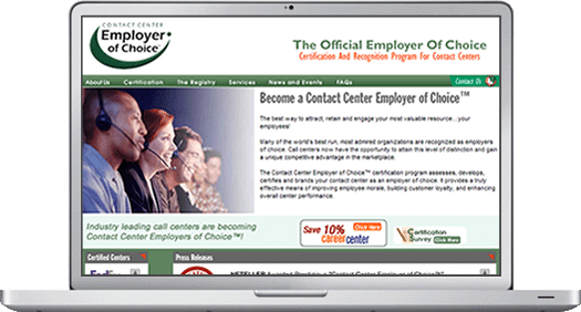
The original site was designed for a desktop view. The image above was the first design in production since the 1st day.
The site itself uses an HTML framework along with various flash components including banners, tickers, news updates and a ticker for company logos. There was also a simple CGI contact form included.
Goals
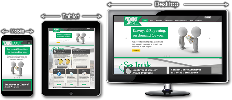
With smaller form factors becoming more popular, the client requested their website to evolve with the times. It was important the redesign site adapt itself to be viewed on smaller form factors, including desktops, tablets, mobile devices and various sizes of hybrid devices. The market share of websites was becoming more responsive and popular. Also, they wanted to keep their variety of services competitive with other online competitors.
App or Responsive
During the planning phase, a decision had to be made to use break points or device specific targets. It was determined that creating a specialized app would require more resources to develop and maintain, since, two different versions had to be created for Android and iOS devices. A decision was made to select an responsive design using HTML and CSS style sheets as the best route because of cost, time and least amount of maintenance. Going down this route would allow the site to be viewed on most platforms created in the last couple of years. Lastly, it was important the site be made future proof, as much as possible, resulting in a longer shelf life.
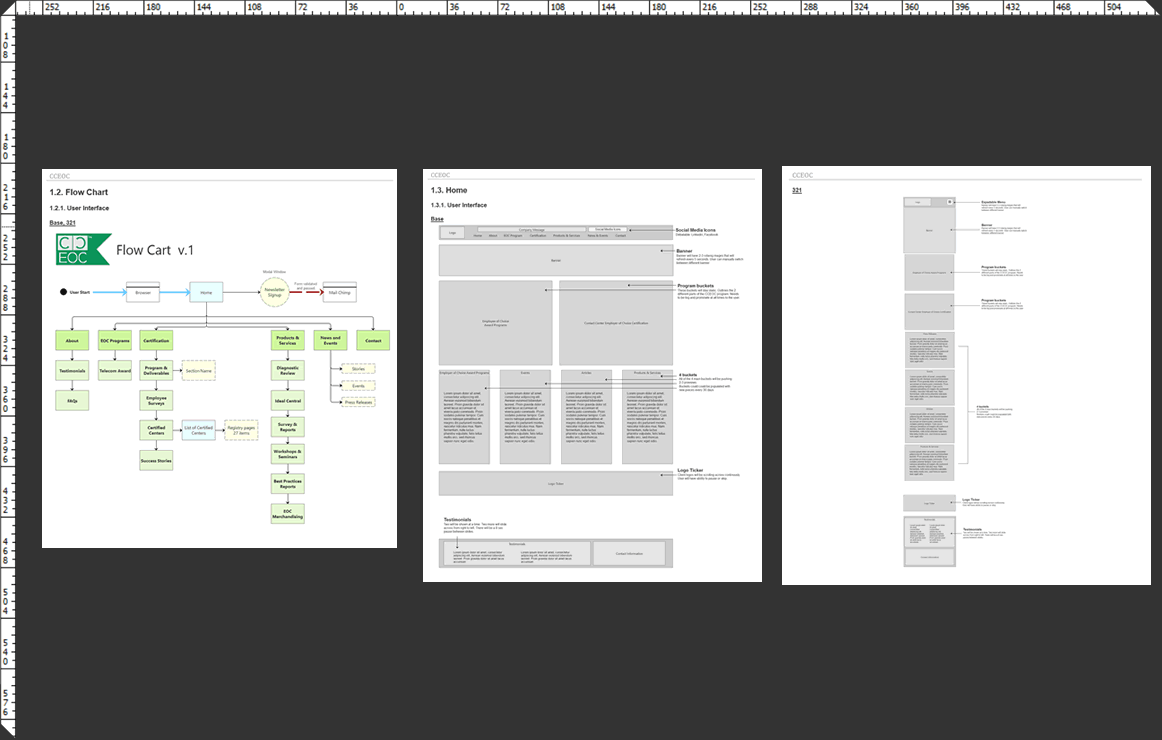
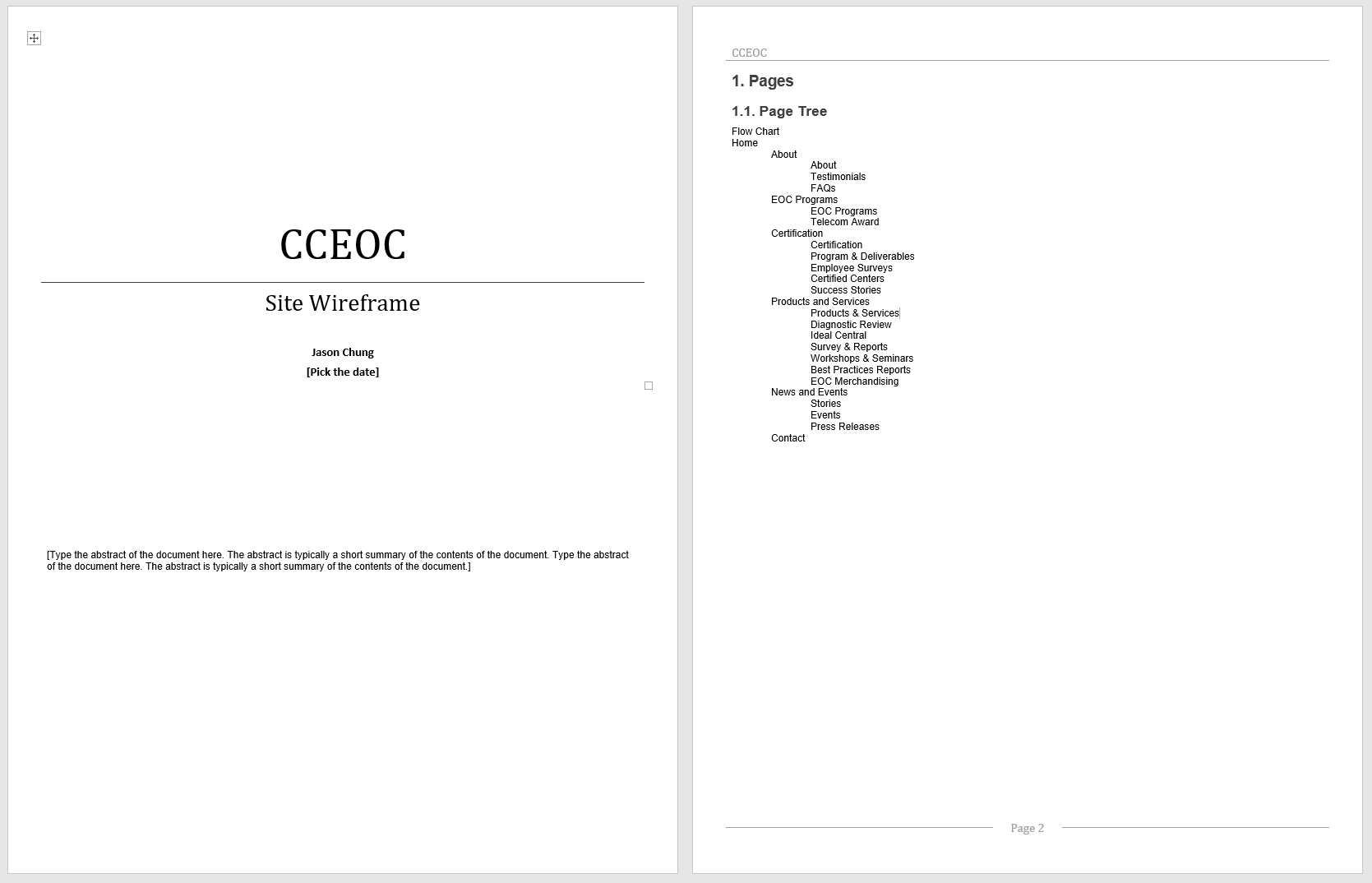
Mapping the 'Flow'
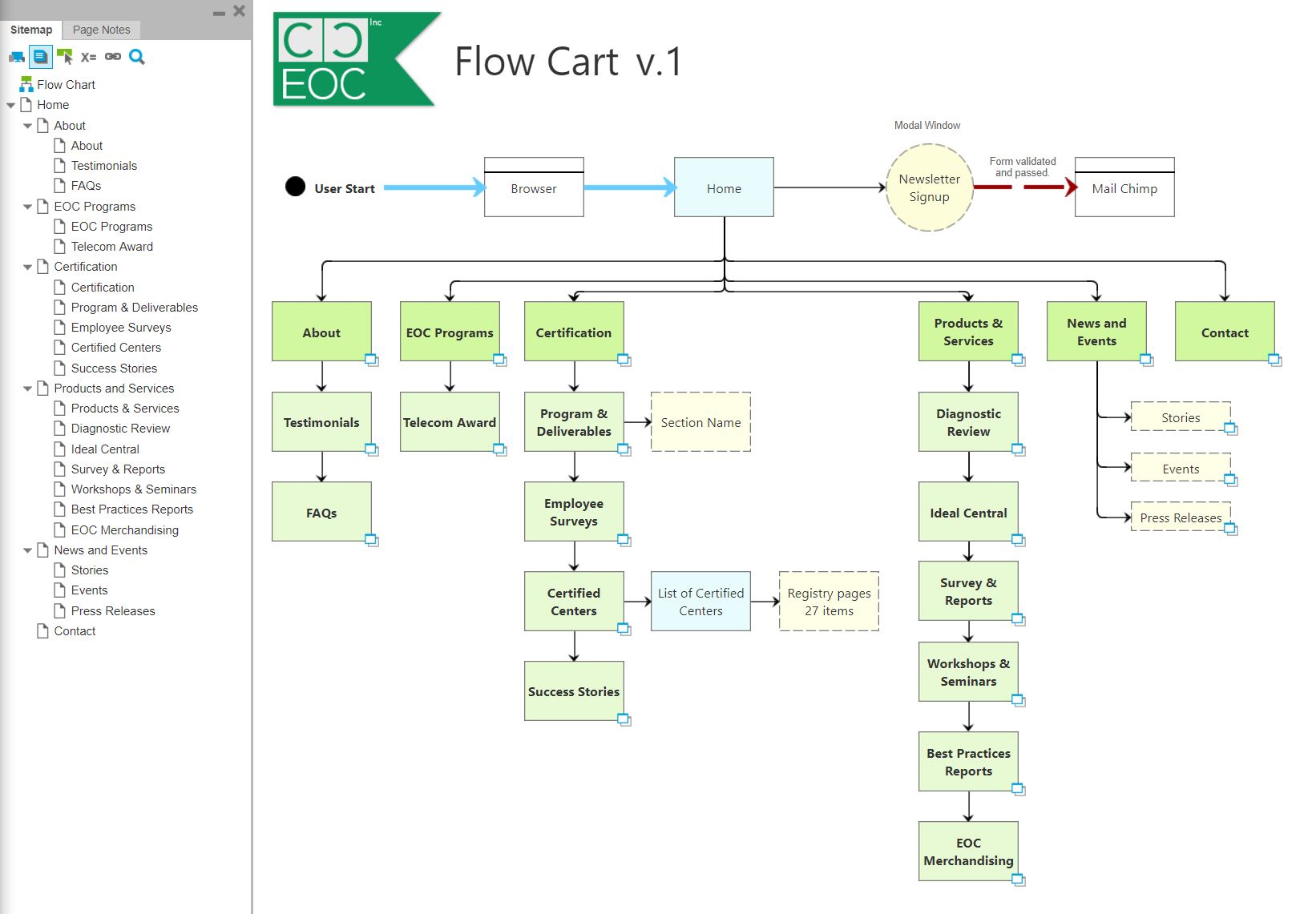
A flow chart was created to map out the entire existing website. This allowed me to make estimates on how many production hours would be required to complete the work. Also, the flow chart aided me in having productive conversations with the client to see what pages he would like to add, delete, or modify. Once in the HTML production phase, the chart was used as a visual tool to check mark off which pages have been completed.
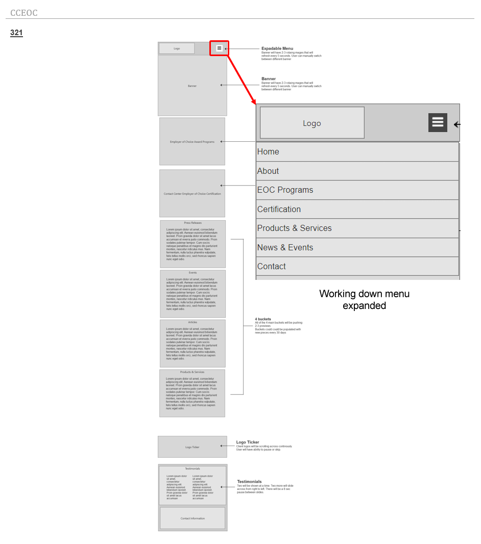
Laying out the new 'Wireframing'
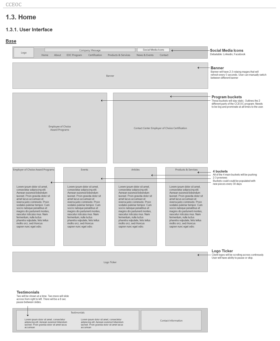
The next step was to wireframe the main sections of the website. At this stage, it was important different elements of the page be assembled quickly and manipulated easily. To keep things looking simple, plain grey boxes with labels were used to represent different design elements.
Creating wireframes helps with ideas on how elements would fit and work together without deciding on what colors or graphics to use. It provides the client a quick glance of how the page would look. Any requests for modifications can be done quickly. With the use of the Axure program, I am able to create separate wireframes for different break points, including desktop, tablet, or mobile devices. Another advantage of taking the time to wireframe is that additional pages can be added quickly as the site matures over the years. By using the document as an existing roadmap, it would save time if the client wishes to do another redesign in the future.
Prototyping
At this stage, working parts of the website are simulated. In this case, 'Axure' was used to simulate how a working drop down menu would function and show how a working website would flow from one page to another.
Prototyping can simulate the use of modal windows, fill in forms and responsive behavior. Making changes in the prototyping phase is easier than in the development stage. The entire prototyping site was uploaded to the web allowing the client to visualize how the site would operate.
Publish Reporting
While working on the wireframe or prototype phase, a site report can be generated for the client showing the progress of the project. The report shows the layout and the functionality of the pages of the website.
By referring to the table of content, the client is able to add comments to a specific section of the report with requests to be reviewed and updated.
User Interface Design
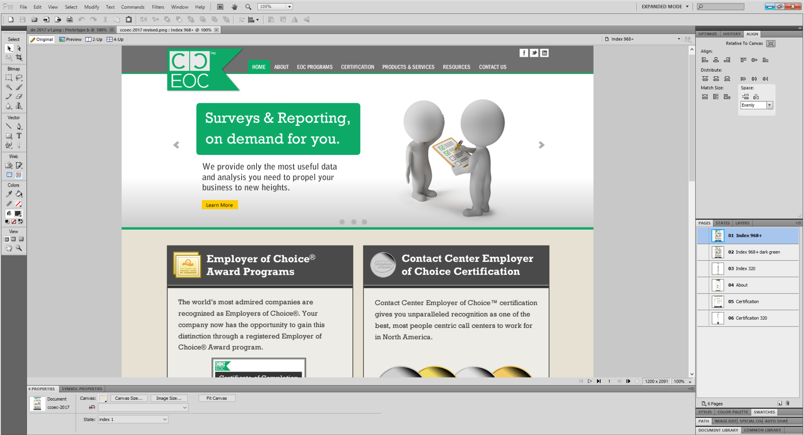
The UI design stage can begin once the wireframe is partially or completely done. In this case, the design phase started after the wireframe and prototyping phases were completed. The sections outlined in the wireframe are now dressed up with design elements. During this phase, specific elements relating to color, fonts, styles and graphics are used to create a graphical layout.
The purpose of this stage is to give the client an accurate view on how the site is going to look in different device platforms. Here, designs based on wireframes can be reskinned quickly to show various color schemes, fonts and graphics.
Site Development
At this stage, customized HTML templates and CSS style sheets are created. Using CSS style sheets can help allow a website to be reskinned quickly at a later date. Child pages can be created from parent templates. During this time, the site was constantly being tested for any broken links or broken elements.
A responsive website requires extra customization for CSS and HTML code resulting in around 20 percent more time for developing
Final Release
Now that the site has been completely developed and tested, the entire site is uploaded via FTP to become live and successfully viewed on different platforms and devices.