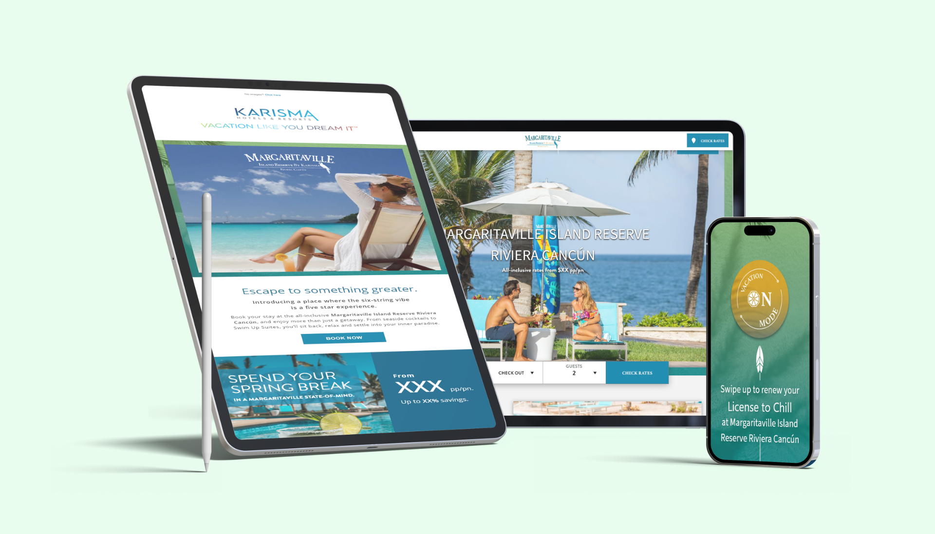
Margaritaville Island Reserve Riviera Cancun
Margaritaville Island Reserve Riviera Cancun is an adults-only, all-inclusive resort located along the stunning coastline of the Yucatan Peninsula in Mexico. Inspired by the laid-back lyrics of Jimmy Buffett, this tropical paradise offers a “change in latitude” for those seeking an escape from the everyday.
My Role
Research, Profiling, Wireframes, Prototyping, Template Testing Low Fidelity Design, High Fidelity Design.
What I did
- Media Campaign Planning
- Social Media Research
- Content and image layout planning
- Wireframing
- Final template designs
- Page template specifications
Project Goals
Margaritaville is a parent company to a chain of hotel resorts spread across different countries. The main focus of this project was to promote the Margaritaville Island Reserve Riviera Cancún hotel accommodations and services. The social media campaign was designed to help visiting customers back to the Cancun Hotel resort landing page. For email subscribers, a customized email promoting the hotel would be sent to them with a CTA link leading to the hotel landing page.
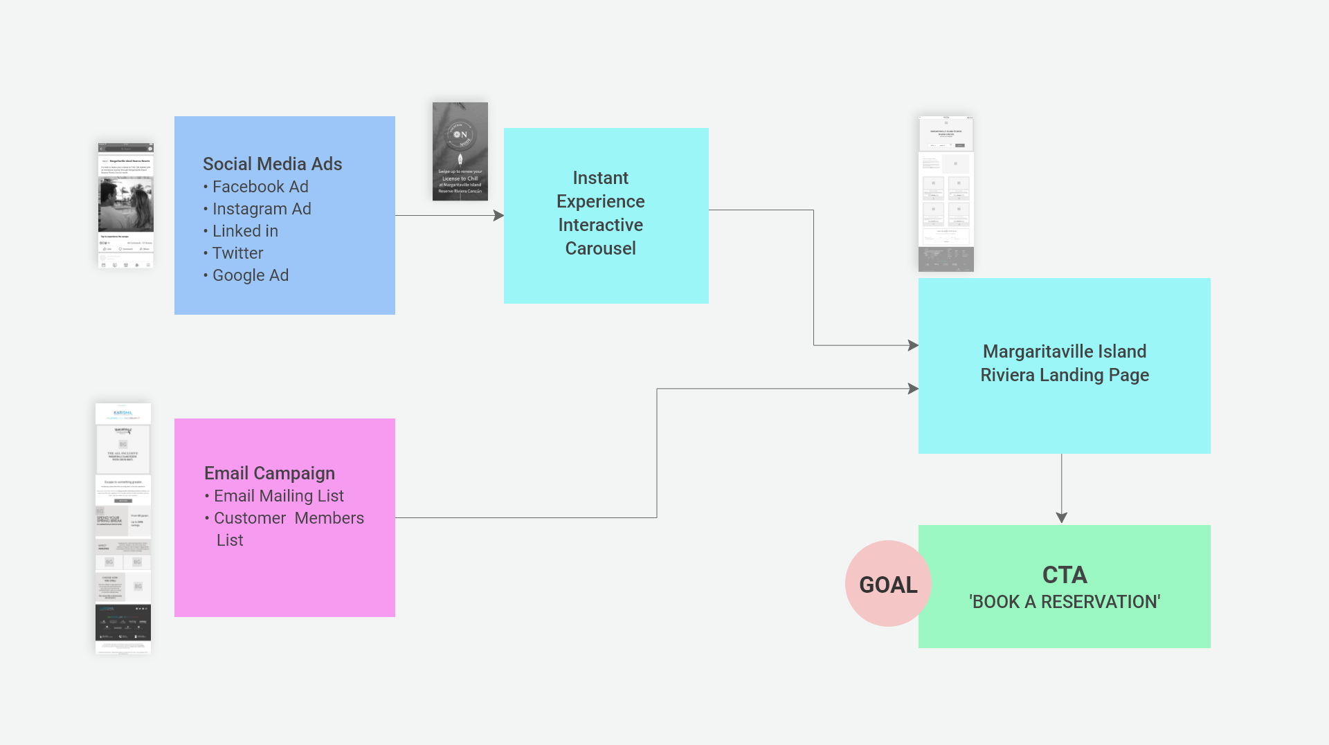
Creating a Guided Journey
A guided journey for the Social Media Ads and Email Campaign leading back to a landing page was mapped out. The ad was adapted to work on different social media platforms. The ads would lead to an Instant Experience Interactive Carousel, creating an interactive experience. The email campaign component would leverage images from the Instant Experience Interactive Carousel. The goal was to lead the customer or Margaritaville member to the hotel landing page to encourage a vacation booking.
Brand Research & Messaging
To help understand the Margaritaville brand, the following marketing materials were researched:
- Company style guide
- Company philosophy and message
- Electronic Banner guidelines
- Campaign messaging strategy guidelines
- Social media guidelines
- Audit of photographic stills, videos, and production ads
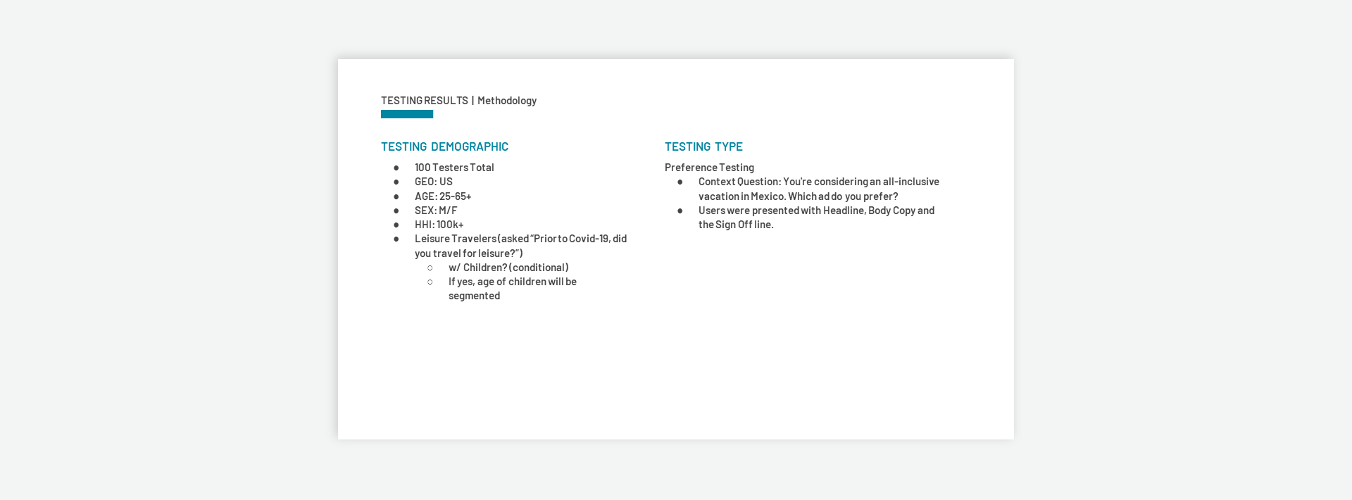
Testing Demographics for Headlines, Body & Signoff Line
A series of online tests were conducted, to test a variety of headlines, body copy, and signoff lines. A panel of 100 testers based in the United States was used for each online test. The test panel participants were targeted to the age range and income level of people who could afford a vacation at the resort.
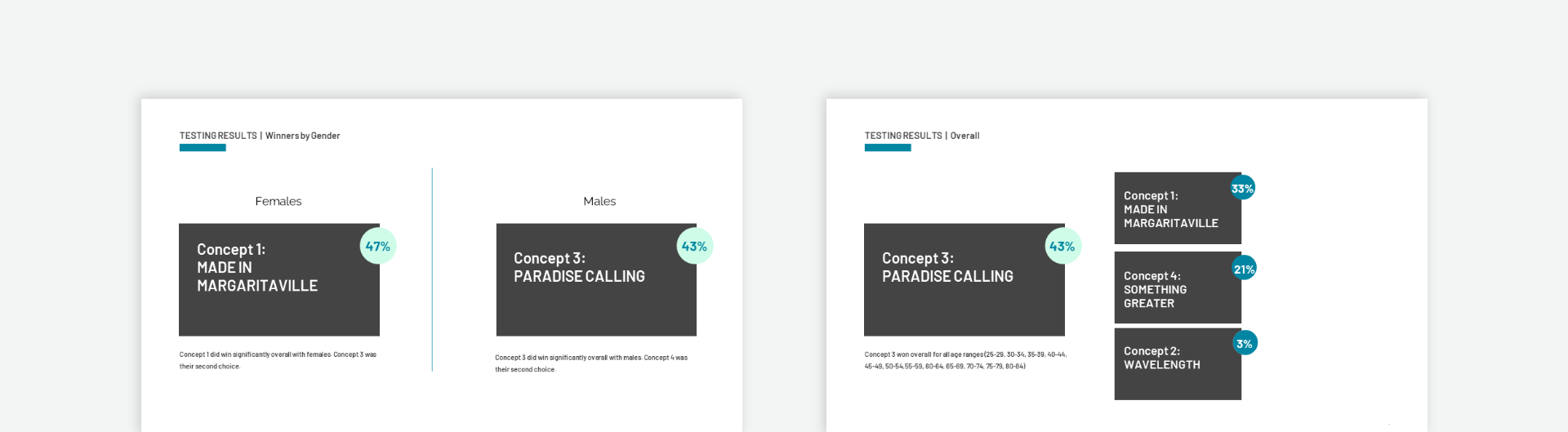
Headline Copy Testing Results
There were 4 different headlines tested against each other. It was important to select headline copy to appeal to a wide age group of men and women. The results below show the statistical breakdown of age and gender. Overall, Concept 3 "Paradise Calling" was the winner.
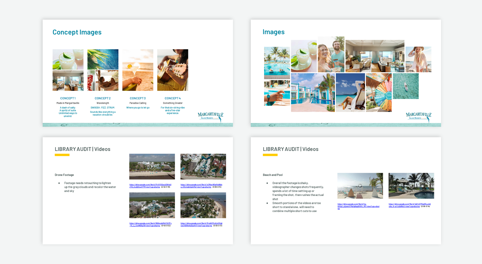
Images & Videos Audit
An audit of messaging, images, and videos used for the previous Cancun hotel campaign was reviewed. Examining previous materials helped direct the creative direction for the project.
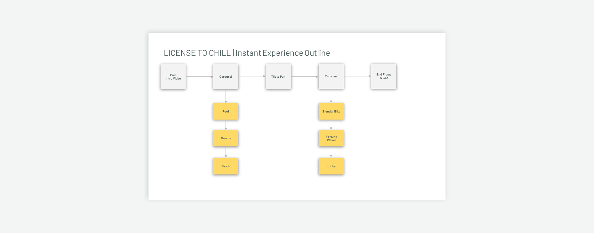
Instant Experience Outline
An Instant Experience is a carousel-based type advertisement linked to a social media post. It allows you to have an interactive multi-framed advertisement. Displayed below is the mapping for the Instant Experience.
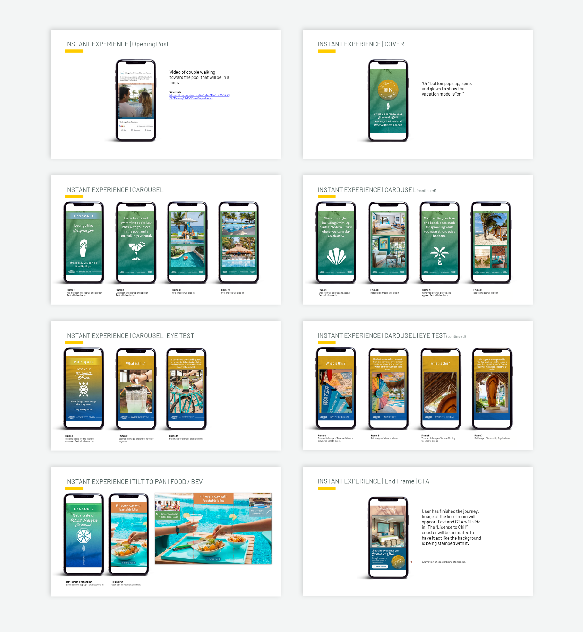
Instant Experience Final Layouts
Based on a series of storyboard wireframes, a complete set of high-fidelity templates for the Instant Experience carousel was completed. Below is the carousel screen progression as the user swipes forward using a mobile device. Each screen displays ad copy accompanied by one vivid image to help push a vacation narrative. To make things more interesting, a fun eye test was also included.
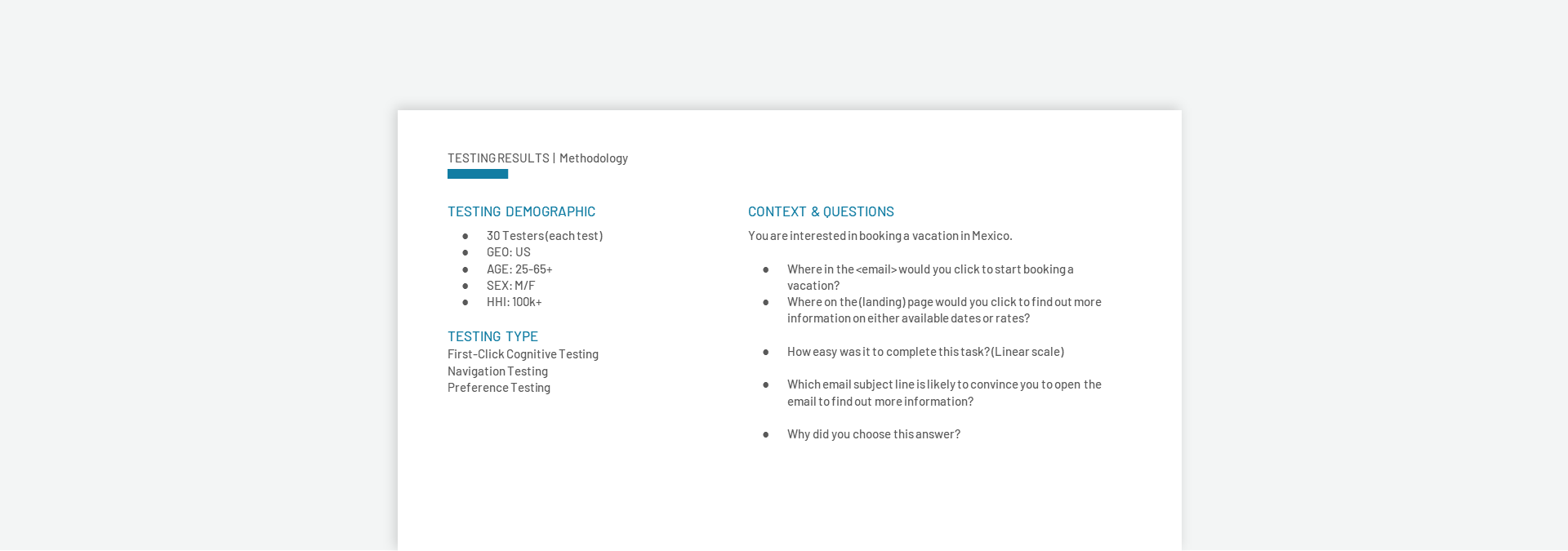
Email & Landing Page Testing Guidelines
Online testing was conducted for email and landing page components. The testing demographics used are very similar to the headline testing. The 3 different tests conducted also included question and answer.
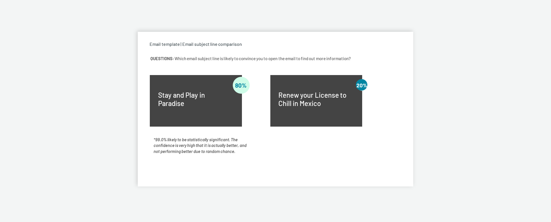
Email Subject Line Testing
This part of the test was to test different email subject lines. A well written email subject line was needed to convince the user to continue to read the rest of email. The results shown below, indicated there was 99% confidence that the subject line on the left would be more effective.
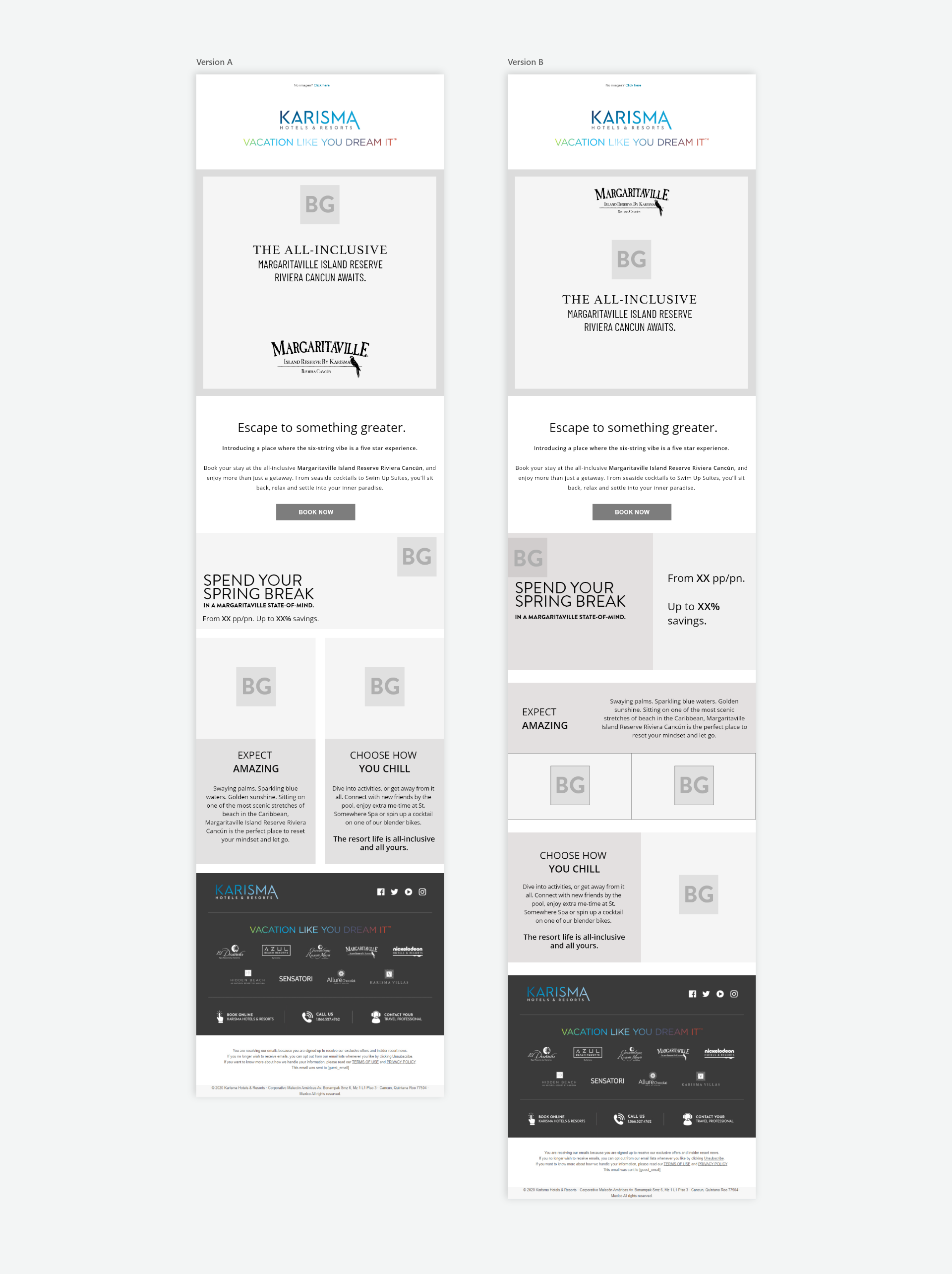
Email Wireframes
Shown below are two email wireframe concepts. It was important the "Book Now" CTA was bold and easy to find to lead a user back to the hotel landing page to allow them to book a vacation easily.
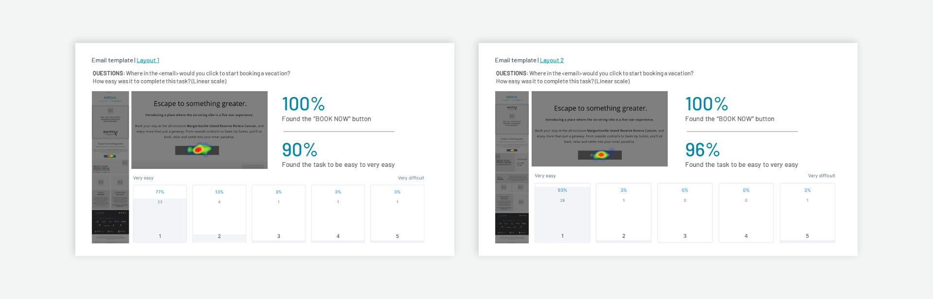
Email Template Testing
The results of the email test shown below demonstrate a close outcome. In both tests, there was a tie for the number of participants who found the "Book Now" CTA. The only difference is, that Layout 2 showed a 6 percent difference in the number of people who found the CTA easier to find.
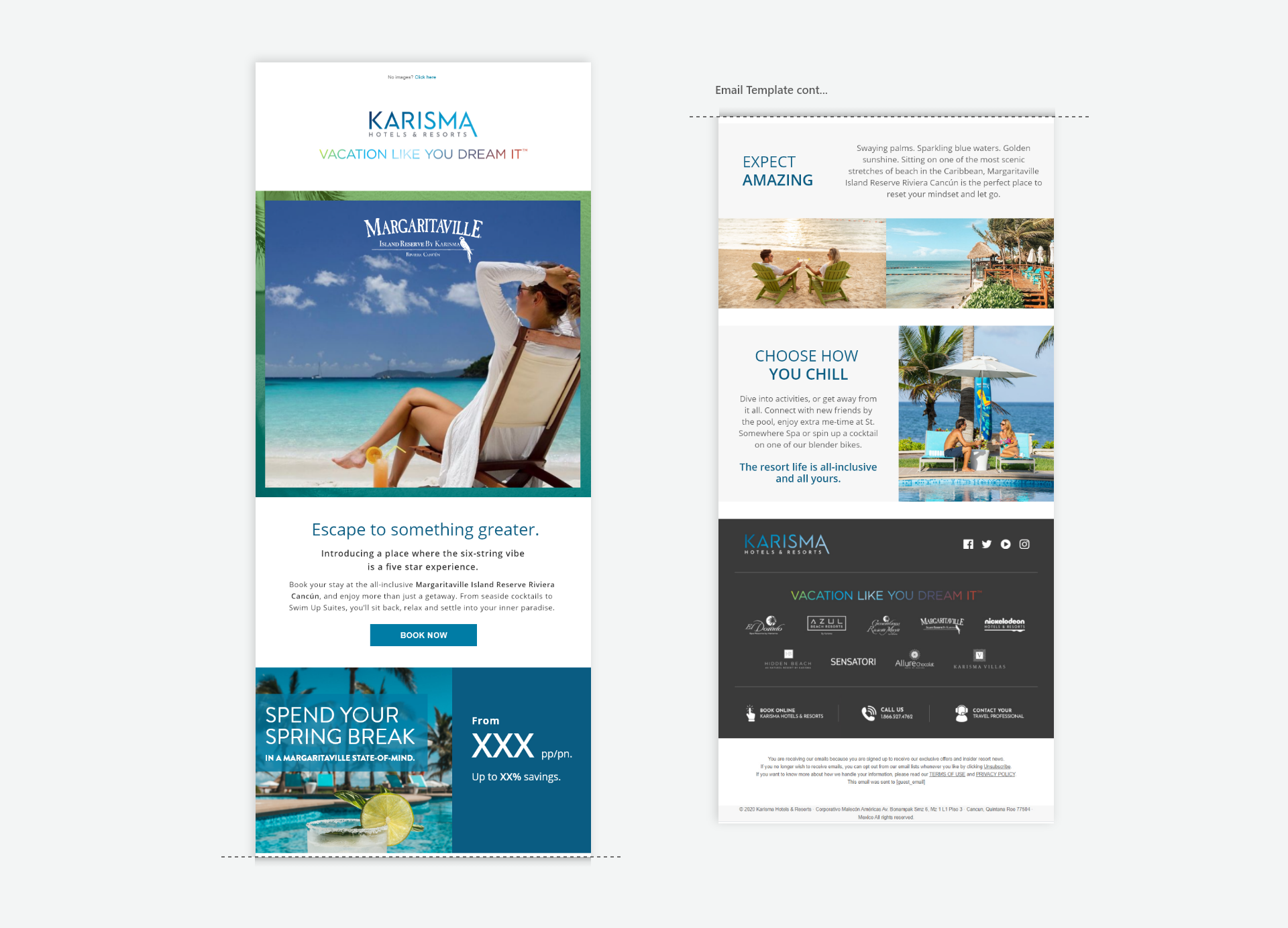
Final Email Template
The final email template based on Layout 2 was chosen due to the larger number of participants who found it easier to use. Along with the selected email template, the subject line, header copy, and images were used from the initial research stage.
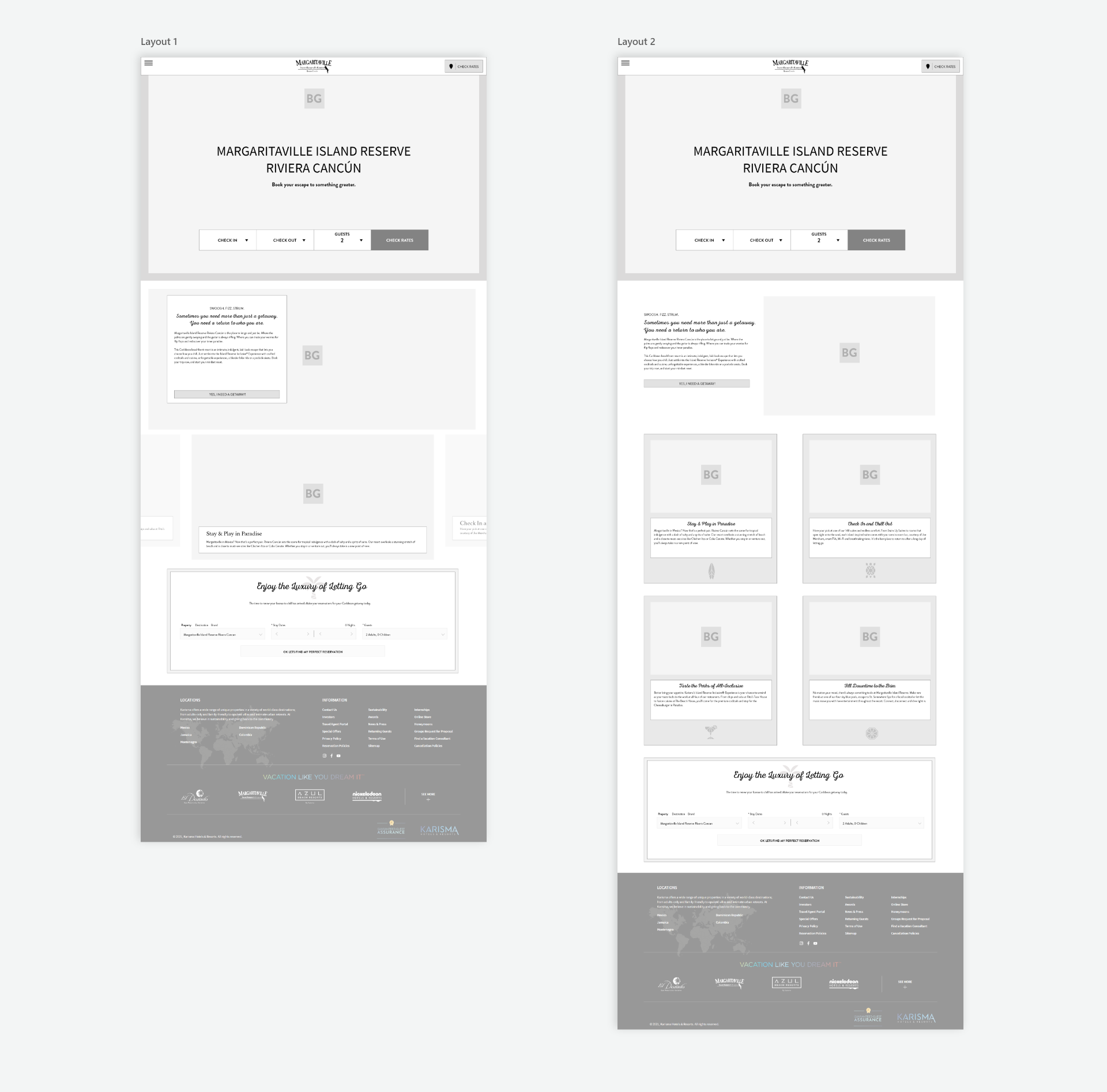
Landing Page Layouts
For the next test, 2 different landing pages were used. The main difference between the two is that Layout 1 uses an animated carousel while Layout 2 uses a multi-column approach to present various features, of the hotel.
Landing Page Template Testing
Below are the test results between the 2 different layouts. The majority of 1st clicks were similar between both layouts. The results also communicate the ease of use was excellent for both layouts.
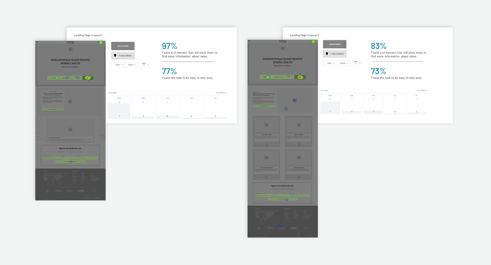
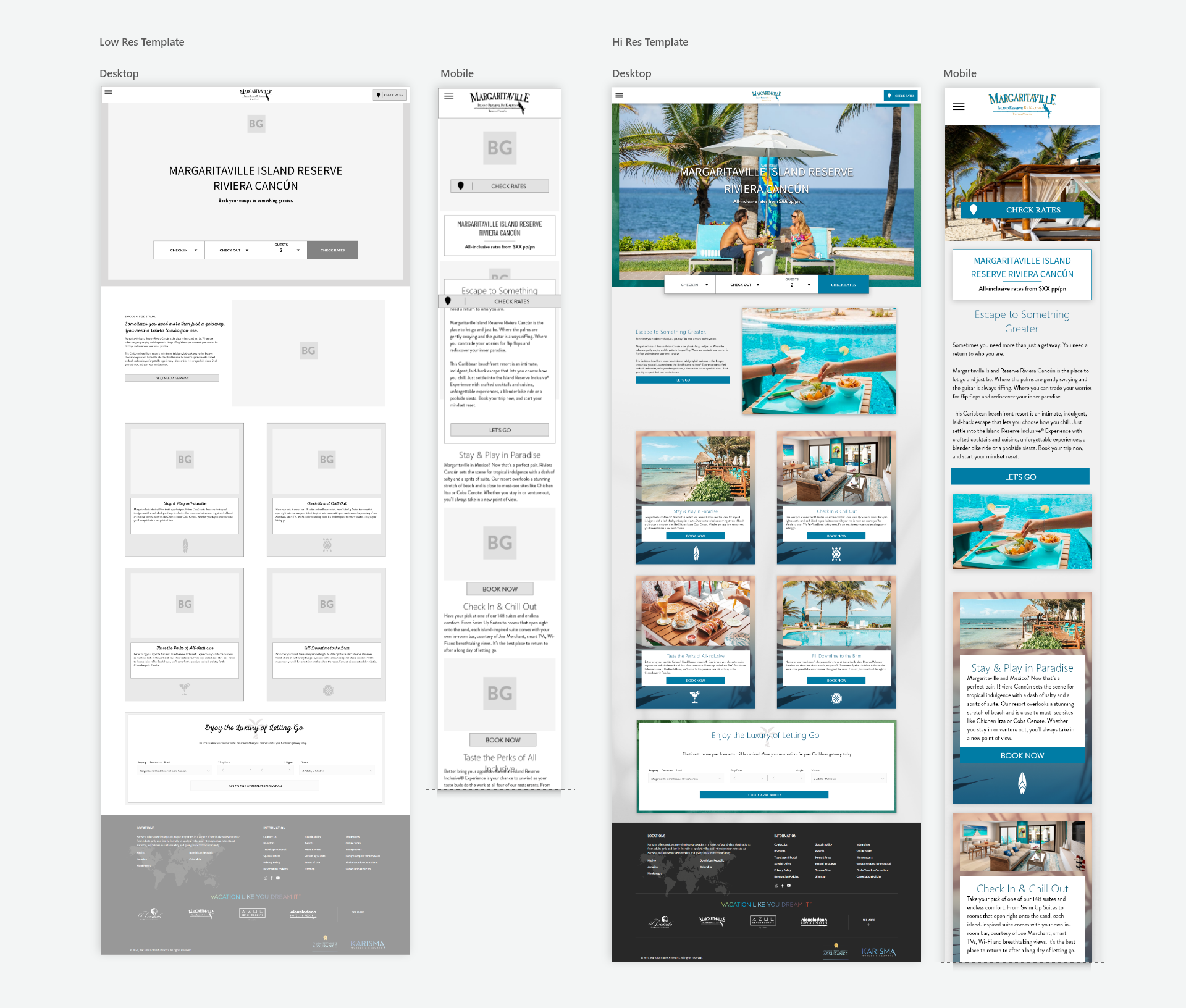
Final Landing Page Template
From the results, Layout 2 was selected for having more hotel features, laid out in a grid format. In Layout 1, the carousel view was selected, the user would be limited to viewing one image at a time. To see the next or previous image, the user could scroll forward or back to see all the features one at a time.
Conclusion
Templates made up of social media ads, instant experience, emails, and landing pages, were given to the client to be developed. Overall, the client has given overwhelmingly positive feedback for all of the final templates completed.